
During sketch development I find that I understand what I would like to “sculpture” in my design from the section lines I draw as a base, as well as from “leaving out” areas. However, if you want this to come across to the people making the decisions, you need something that stands out and jumps off the wall in a presentation.
Traditionally I used to use the base sketch as an underlay over which I would then draw the clean lines, and would put some marker and pastel on it to give some 3D effects. However, if you did this quickly, it would look like that, if you did it properly it would actually become a rendering and be quite time consuming. Another risk would be that in “cleaning up” of the lines, some of the character of the original sketch would get lost.
Without trying to take any importance away from traditional art methodologies, these days it is possible to use the original sketch to make quick and eye-catching artwork that not only represents the original raw design ideas to the max, but also does the job of jumping off the wall during a presentation. A good sell.
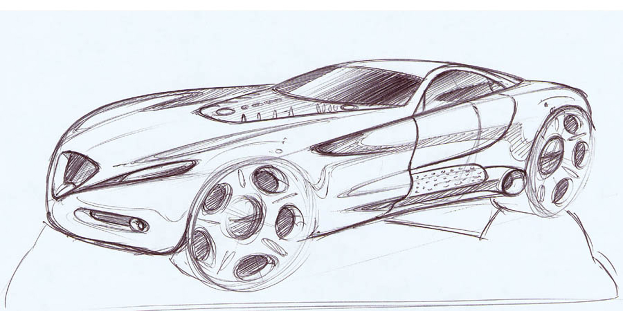 Start by scanning in a sketch that you want to use. (image A001sketch.jpg) It does not matter if it was sketched on excellent marker paper or on a napkin at “In ‘n Out” Burger. It just needs to be just the thing you like and you want to present. Import that scan into Photoshop, duplicate that layer, clear the background layer and set the transparency of the background copy layer to 35%.
 This way you can see the sketch, have a white background still, and work click the sketch on invisible once you’re finished.
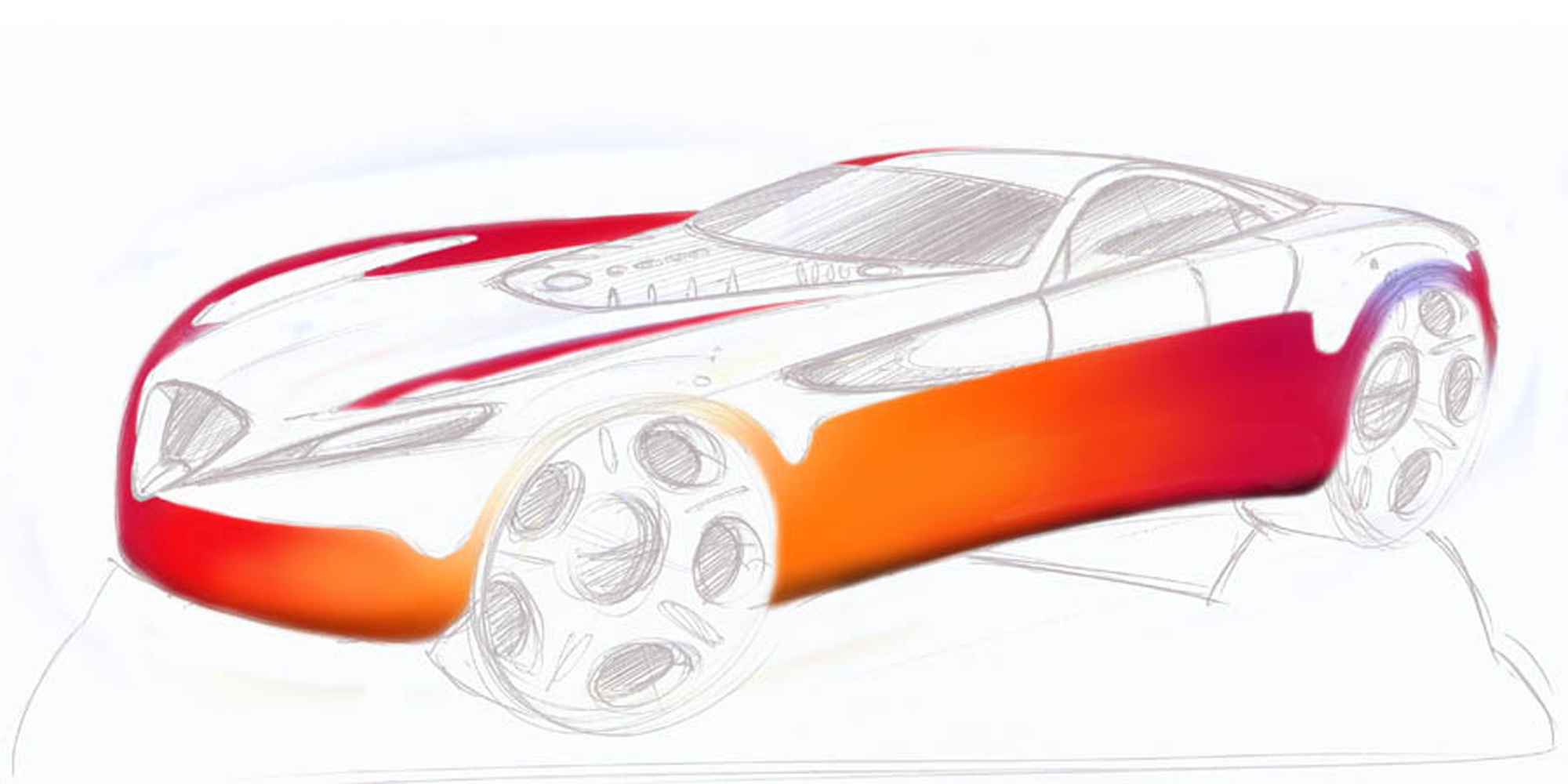
Block in the basic colors with 200-300 size airbrushes. In this case the car was going to be red, and I like using the warm and cold sides of the real world in my sketches to enhance the sculpture. Simply erase the areas that form the hard reflections manually. This gives a more spontaneous effect and is quick.
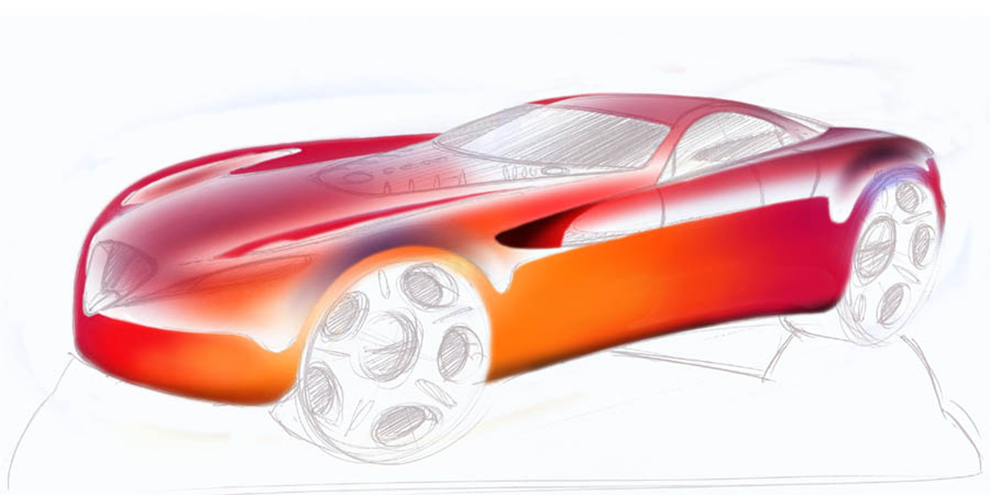
On a new layer again quickly airbrush the sky reflections, also here using the warm and cold colors. And again manually erase the overflow of airbrush. Here set the eraser too airbrush and use a 65-100 softness.
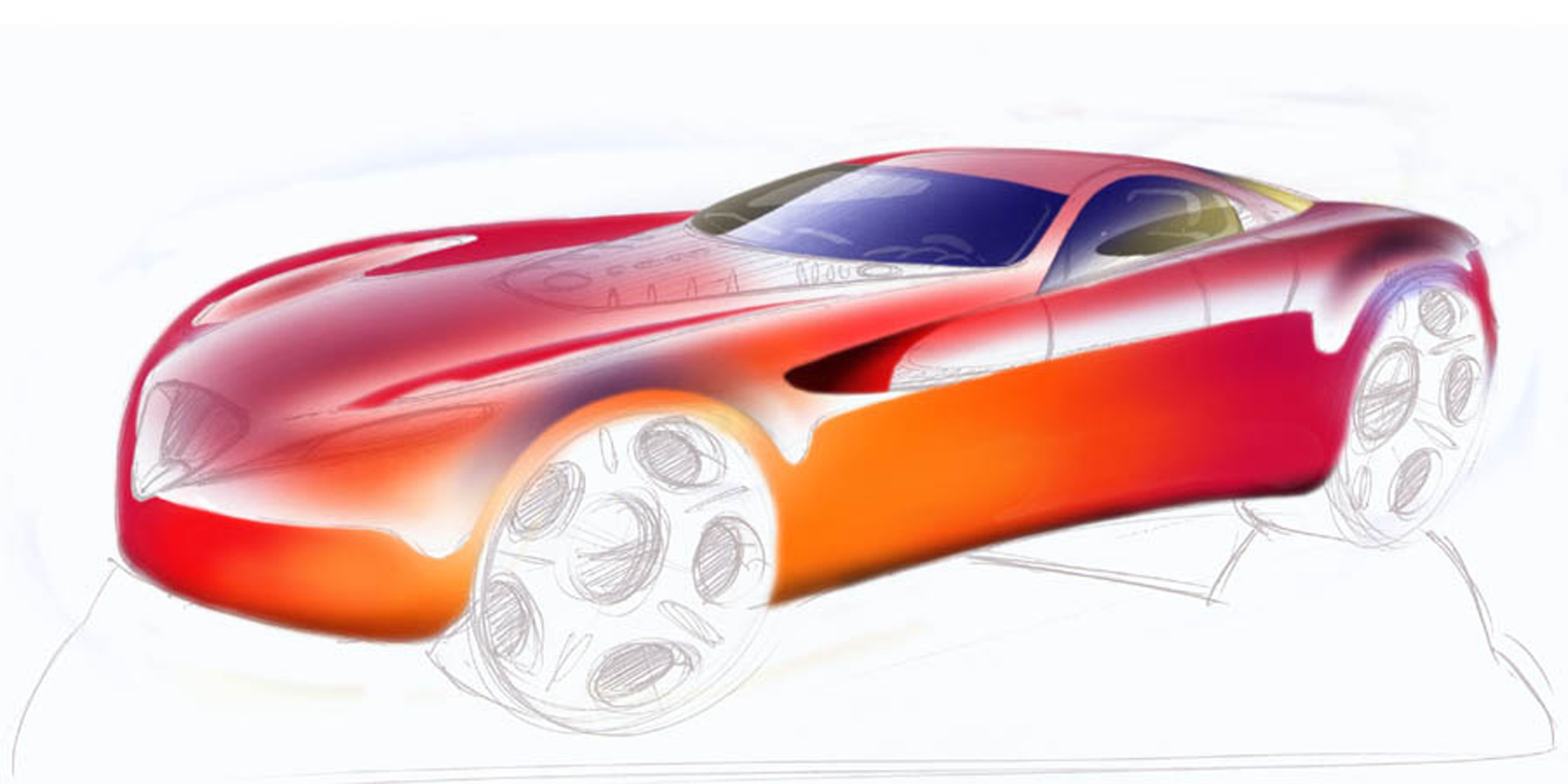
Similarly built up the glass areas, though there you initially use the colors lightly, then duplicate that layer and erase the highlight parts of the interior off of the first glass layer. This way it seems you can look through the car, which enhances the realism.
This is the time to put the car on the ground. Make a quick path in the path tools menu, and adjust it to fit the area of shadow marked off in the sketch. In the path menu save this path, go to “make selection” with a 0 feather, and go to the layer menu to make a new layer. On this layer you fill the selection with the background color you want and add a few brush strokes in different colors for good measure.
 Subsequently put in the wheels, so the car sits properly. You can usually color the ones you had sketched, but for enhanced realism you can quickly take some stock wheels/tires rendered in Alias and use these. Also you can use pics of wheels/tires from existing cars, but if these are very recognizable it may not help you.
In the lower segments of the body sides and the front you may want to add some soft sculpture to enhance the muscle power expression of the vehicle. Simply make a new layer, and play with black and white soft airbrush, then play with the transparency of the layer to get the desired effect.

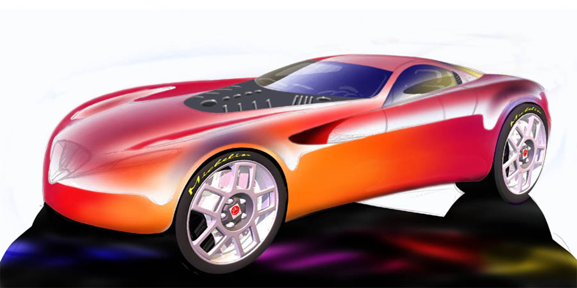
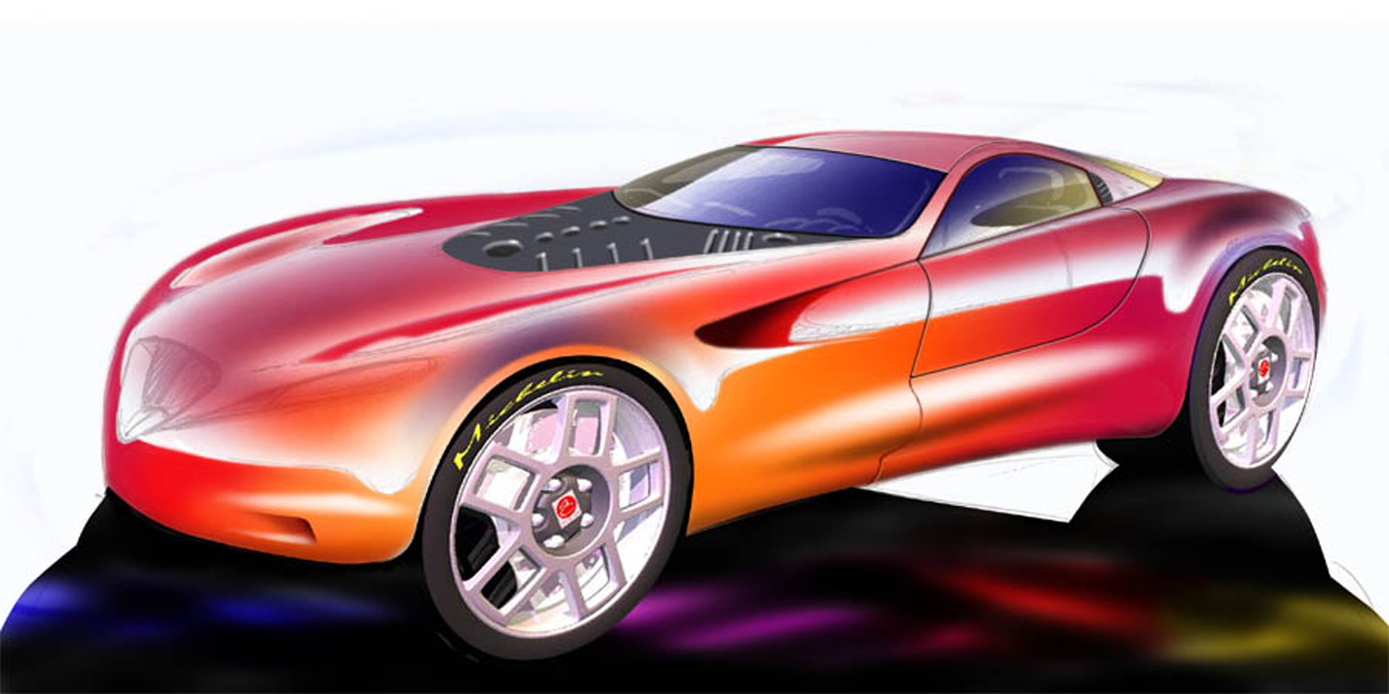
Again use the path tool to draw some clean cut lines on a separate layers.
For this project we wanted to use existing headlights to reduce costs, so you can make several variations with different headlights. On this example they obviously stem from a Mercedes-Benz.
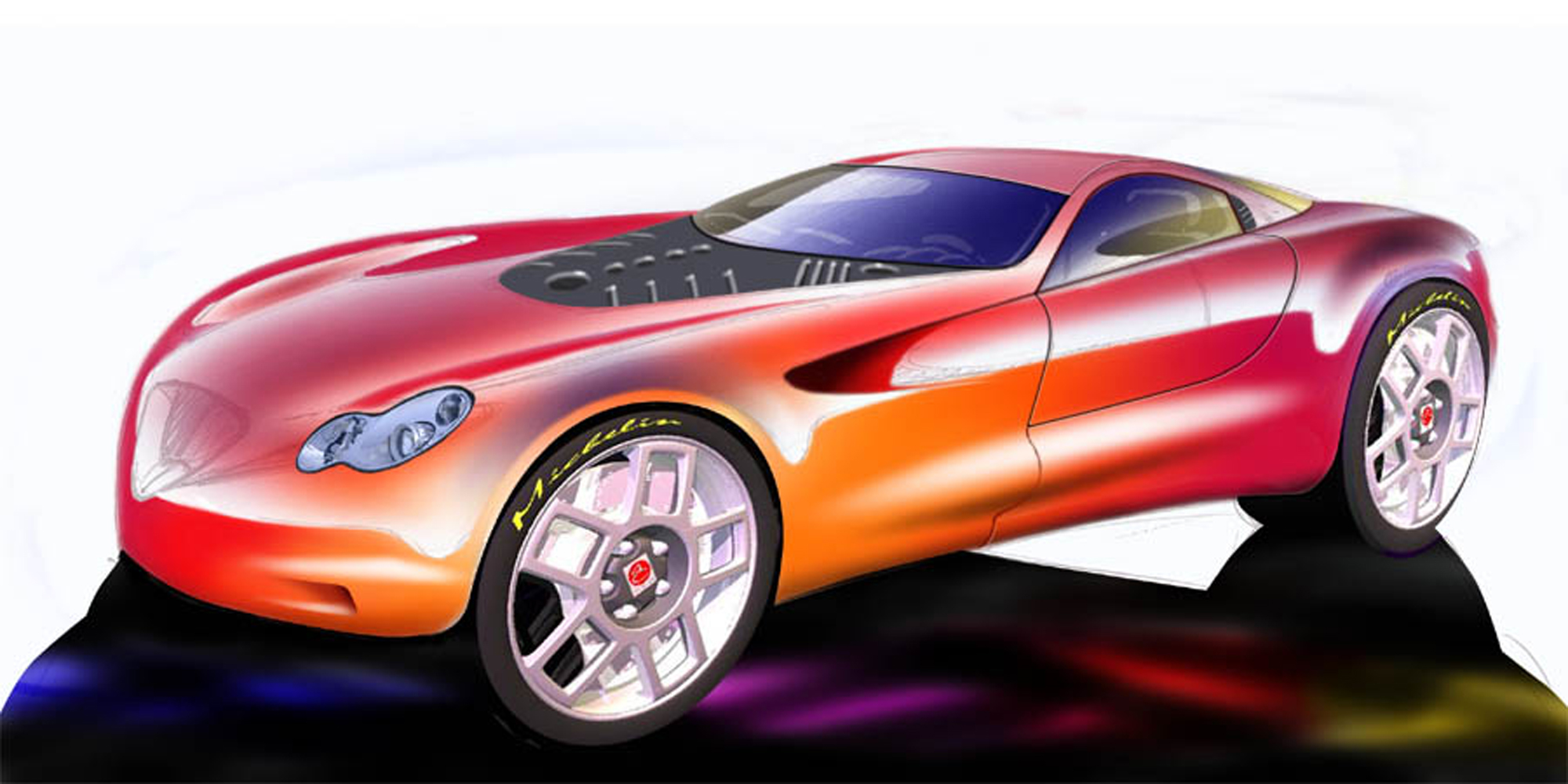
You can also add the grille on a separate layer
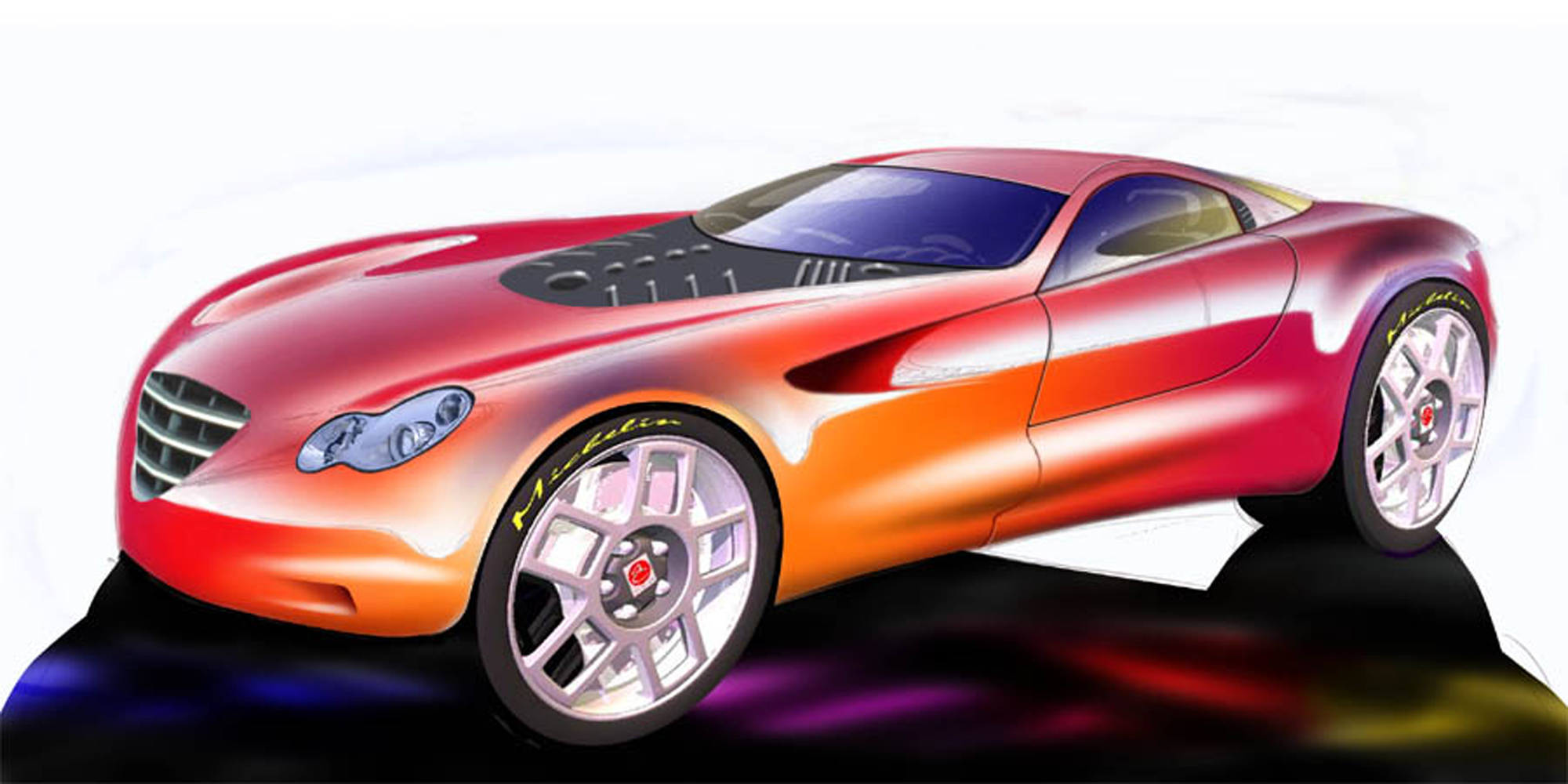 and add the usual corporate graphics to create the final result.
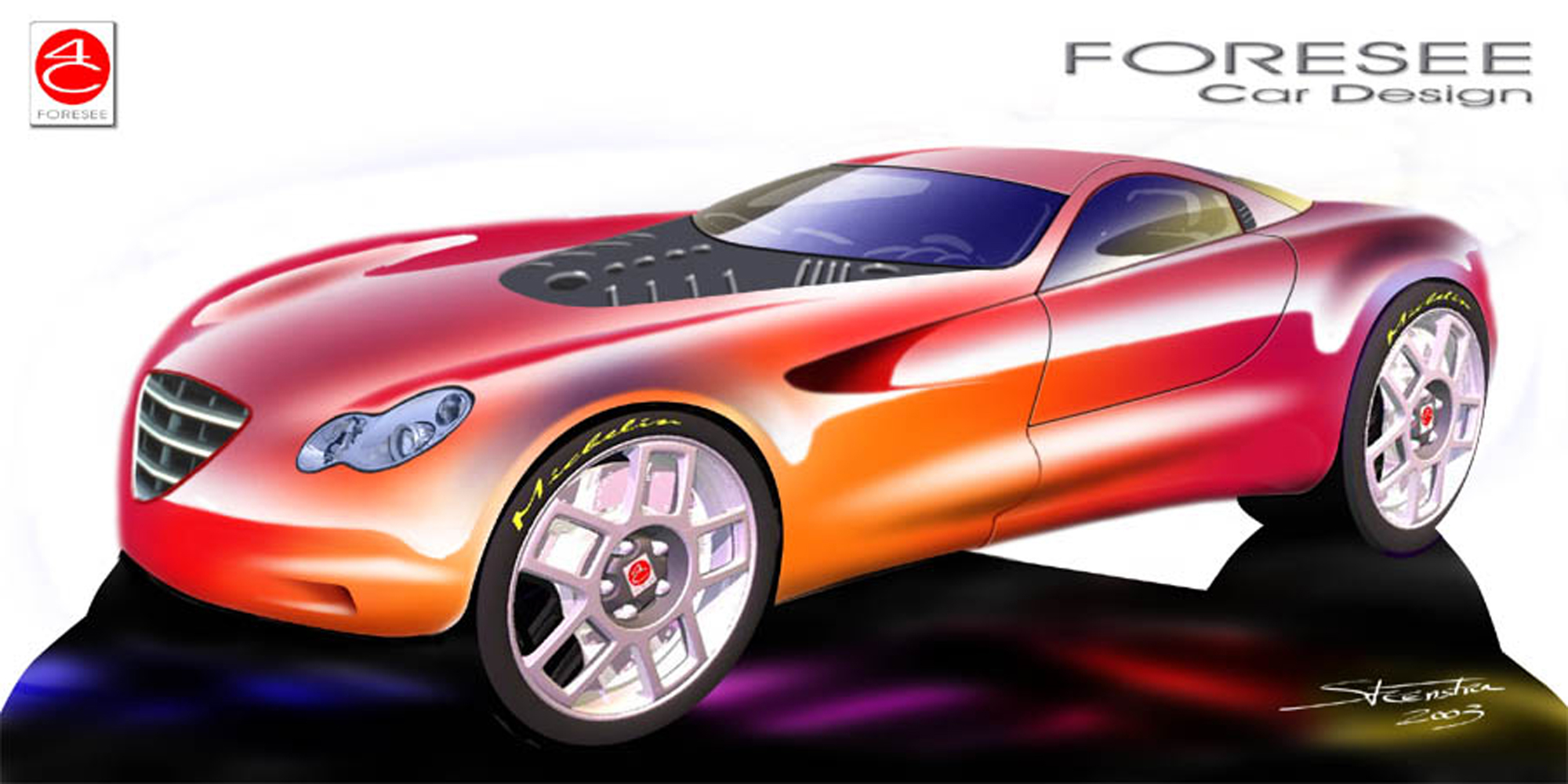
As you can see, it took quite a few layers, but that makes it easy to make corrections afterwards. All in all this color sketch took about 45 minutes to draw, but this can vary of course depending on the level of detail.
Though I clearly use the new technologies, I definitely built up on experiences I gained in using the traditional techniques with marker and pastel. I think you have to go through this stage before you can successfully “optimize” your workflow and not end up with generic looking “impersonal” artwork. In that same respect, I use all of my clay modeling experience in making my Alias models, thereby creating optimal highlighting while keeping character. Again, it is something you “have” to do to be able to optimize your workflow.
Leave a Reply
You must be logged in to post a comment.